Have you seen the new Empower dashboard?
If you haven't logged into your Personal Capital ( Empower ) dashboard lately, then you may have missed the new dashboard interface that they rolled out recently. I hope you like dark blue, though.
A classy Disclaimer: This blog post contains affiliate links! All kinds of affiliate links. Affiliate links galore! You have been warned, my good financial friends. Honestly, don't we all assume these types of posts contain affiliate links by now? ;)
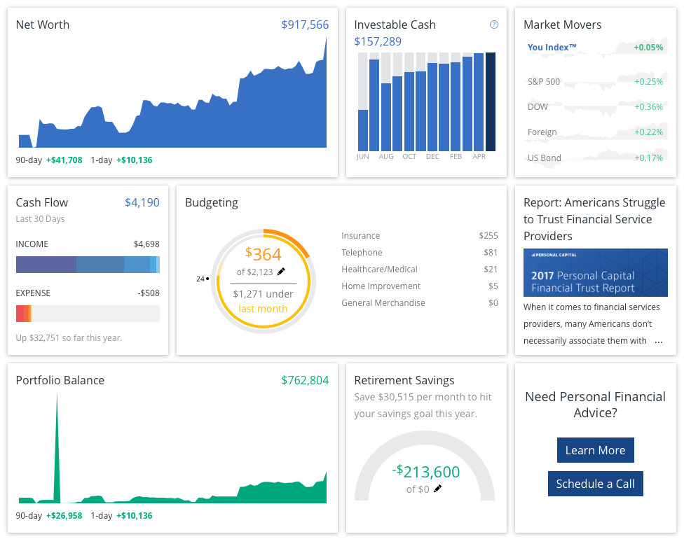
Here's what my Personal Capital Dashboard looks like (from a Desktop device):
Okay - what makes this even more beautiful is the fact that the market generated a $41,000 increase in our net worth over the past 90 days, which is pretty screamin' cool. But beyond the numbers, I'm digging the new interface.
The colors are lovely. Calming blues in the midst of [hopefully] exciting financial times. A more compact look and feel requires far less scrolling than the previous interface.
Less hunting and pecking to find data that probably interests those who are tracking their financial picture on Personal Capital - like, for example, Net Worth, Investable Cash, Market Movers and Cash Flow right there. No clicking. No scrolling.
The graphs changed a bit, too. Previously, the Cash Flow graph contained circles. Now, we're gettin' a couple of bar charts:
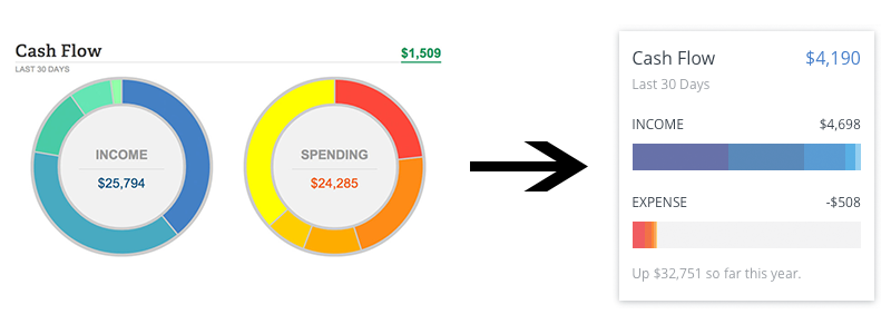
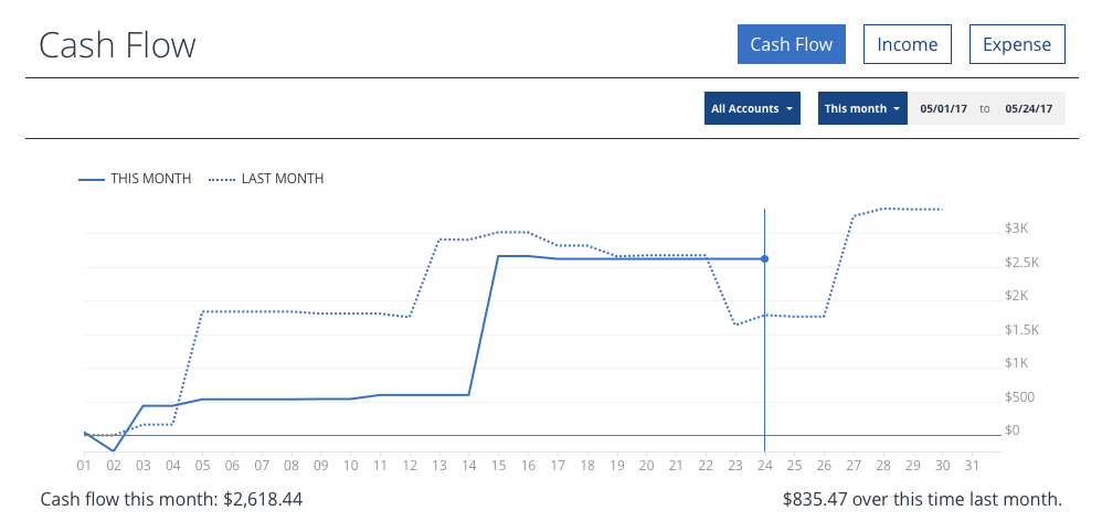
Here's the new Cash Flow page - virtually identical in substance. We aren't necessarily seeing more information. Instead, we're seeing it differently:
It's a Personal Capital Dashboard facelift
As far as I can tell, no additional functionality was added to Personal Capital. This update accomplished nothing more than a change to the look and feel of the Personal Capital Dashboard. But still, I respect the fact that Personal Capital wants to keep things fresh and improving.
🤑 Need a Personal Loan? 🤑
Get the funds you need with Evergreen personal loans. Quick approval and competitive rates!
What was wrong with the previous interface?
As far as I'm concerned, nothing. My major gripe with Personal Capital has always been their inability to connect to some financial institutions. And I'm not talking about small, inconsequential companies, either. Major businesses, like Ally. We haven't been able to connect our Ally credit card up with Personal Capital since we first got it - months ago.
If there was nothing wrong with the Dashboard, why change it? I can't answer that question. But, it's a fair one. Many of us were used to the previous look and feel. But hey, like I said, I like it when companies try new things and push the envelope a bit.
It makes me feel like I'm doing business with people, not some nameless corporation.
So, tell me - what do you think of the new Personal Capital Dashboard? Improvement or a step backward?
Frequently Asked Questions:
What's new in the Personal Capital dashboard update?
The recent update to the Personal Capital dashboard features a fresh interface with calming blue colors and a more compact design, reducing the need for excessive scrolling. The update also includes new bar charts for the Cash Flow page, enhancing the visual presentation of data without adding new functionality.
Has the functionality of Personal Capital changed with the new update?
No, the update to the Personal Capital dashboard primarily improved the visual aspects and user interface. There were no changes made to the functionality or the features of the platform.
Why did Personal Capital decide to update their dashboard if there was nothing wrong with the old one?
While the previous interface had no significant issues, Personal Capital aims to keep the platform fresh and user-friendly. Regular updates can also show users that the company is actively improving their service, even if it's just aesthetic changes.
Are there any known issues with connecting financial institutions to Personal Capital?
Yes, some users, including those with major financial institutions like Ally, have reported difficulties connecting their accounts to Personal Capital. These issues persist despite dashboard updates, indicating that the problem is with account connectivity rather than the interface itself.
What do users think about the new Personal Capital dashboard?
User opinions may vary regarding the new dashboard interface. Some might appreciate the modern look and improved layout, while others may prefer the old version they were accustomed to. Personal preferences play a significant role in how the update is received.