Here's why I like the new Wordpress Gutenberg editor - kinda
Wordpress 5.0 will officially contain the new Gutenberg editor, which completely changes the way that bloggers write content with Wordpress. Here's what I like about it, and why it's still too buggy to use.

Talk about a firestorm of activity over WordPress's decision to include a brand new way to write (the Gutenberg editor) into the next major release of WordPress (WordPress 5.0). If you read the majority of articles out there, you're probably left uneasy and worried. A lot of people just aren't feelin' the change. Many believe it's being rushed.
It is common for change to be met with unease. It's natural, especially after all these years with the traditional visual editor that we all know and [mostly] love. Questions abound, like:
- How will the new editor interact with our current websites?
- Is it backward compatible with older features and plugins?
- Am I just stuck with this editor if I don't like it?
I've used the editor, and believe it or not, there are many things I like about it.
For the record: I fully intended to use the Gutenberg editor to write this post. I tried and I failed. More on this below.
What I like about the Gutenberg editor
Wordpress 5.0 will introduce a shift (read: a re-prioritization) to focus the content management system much more heavily on usability and content creation rather than sheer customization. In fact, the first thing that popped into my head when I saw the new Gutenberg editor was Medium.
It looks very similar to Medium's editor, and Medium has one of the most streamlined, easy-to-use content editors in the business. The writing interface doesn't include styling toolbars by default. Instead, those toolbars only appear when the user might actually want to use them. Welcome to Gutenberg.
Let's start by looking at a blank canvas using the Gutenberg editor.
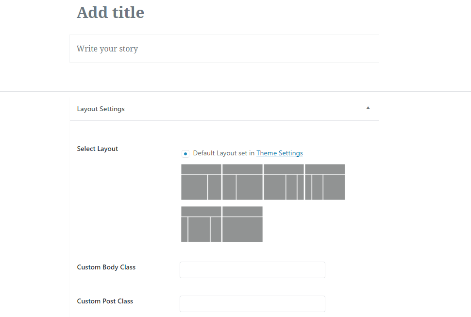
Notice how this is much less "form-y" than the classic editor:
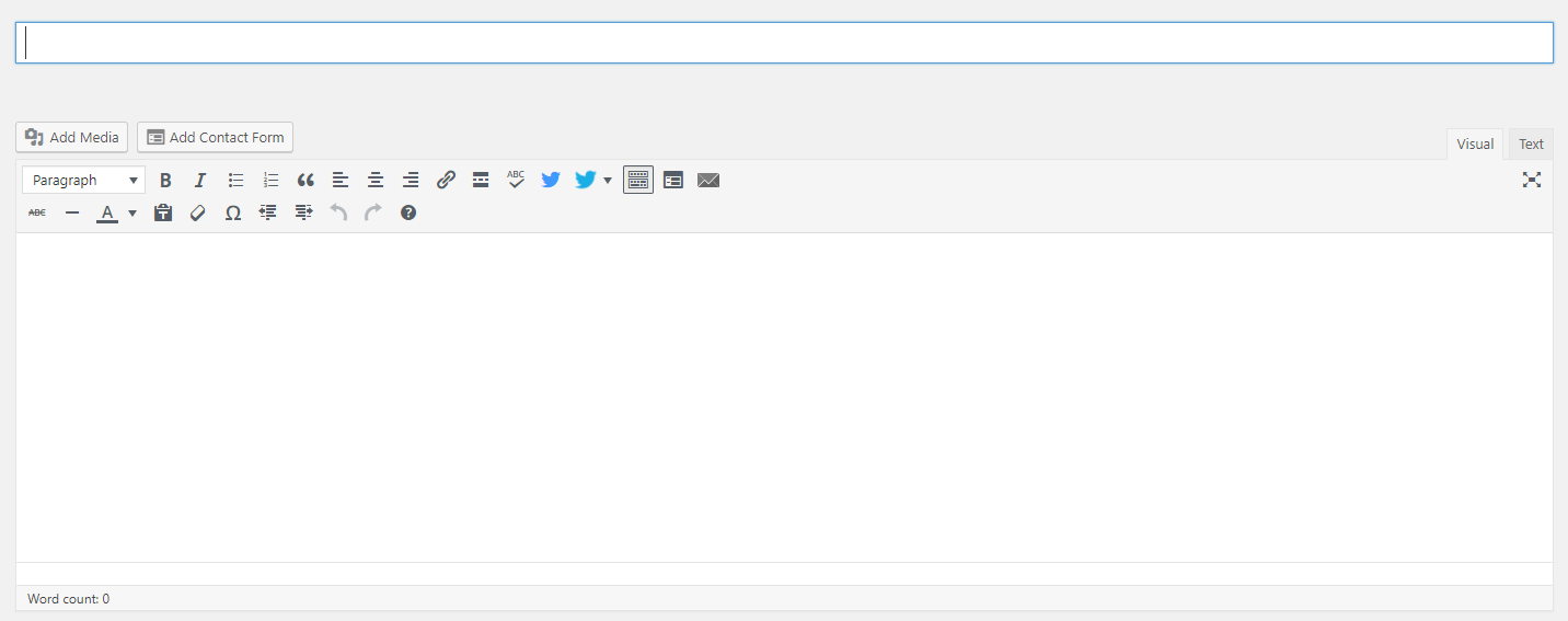
Immediately, take note of the beautiful simplicity of the Gutenberg editor. You're focused only on the essential elements of the post: the title and the content. If your theme supports layout changes per-post, your options will be displayed within 'Layout Settings'.
Writing content
The Gutenberg editor introduces a brand new concept to writing called content blocks. Each paragraph is a block. An image is a block. A list is a block. Each block is treated as an independent element within Gutenberg and can be customized and tweaked separately. When you're writing, a new block is automatically created each time you start a new paragraph.
Blocks can be re-arranged within your post without a copy-and-paste. Hover your mouse over a piece of text and Gutenberg will indicate that it's a block and provide customization options. In the screenshot below, notice that the paragraph starting with "Blocks can be re-arranged..." is selected. Options directly above the block allow customizations of the text within it.
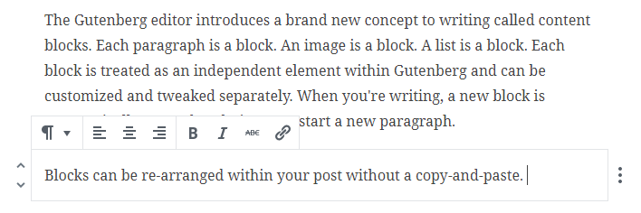
Note: Certain text within each text block can be changed without affecting other text within the same block. For example, I can bold just certain portions of a text block by highlighting the text and clicking the "B" icon:


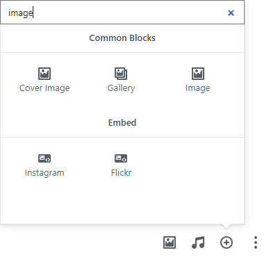
There are all kinds of blocks and embedded options that the Gutenberg editor supports.
By default, supported blocks include Audio, Cover Image, Image Gallery, Text Heading, Lists, and Quotes.
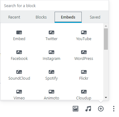
The Gutenberg editor also includes a ton of features and supported external objects, which makes your job of pulling in content from other places super easy. Click on the 'Embed' tab at the top and look through the wide variety of external objects that can be embedded straight into your post. There are a ton of different options, and the ability to embed is one of Gutenberg's primary claims to fame.
What about headings?
Don't worry, headings are still just as easy with Gutenberg (and if you aren't already using h1/h2/h3/etc headings within your posts, absolutely start. Now. They will increase your page's search engine optimization and set you up for better page rankings. I talk about how to write well in my How To Start Your Own Money Blog ebook, by the way. :)
To create a new heading, simply type your heading text into a new text block. Then, hover your mouse over the block, click the little paragraph icon on the left, then select 'Heading' underneath the 'Transform into' area, then select your heading size. Yes, there are more clicks involved with this.

Other cool features
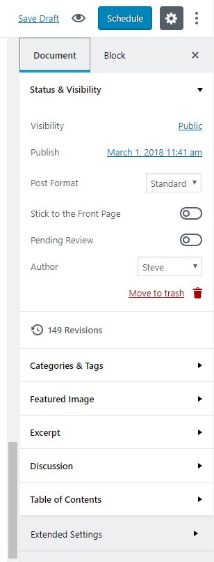
Your toolbar is still on the right when creating new posts, and you'll be able to tweak document-wide settings, along with configurations for the active block, in that area. This area contains a bunch of visual enhancements over the classic editor.
For example, using the classic editor, I had to install a plugin for a visual calendar to display whenever I schedule a new post. With the Gutenberg editor, a calendar is already integrated. The calendar displays when the date to the right of "Publish" is clicked.
Excerpts are a way to manually control the preview text for a post and can be edited straight from the toolbox by expanding that area and typing into the textbox.
The Table of Contents feature allows editors to quickly scan the document for major (and sub) headings. Wordpress will use your h1->h6 headlines that you've already placed within your document to automatically build the Table of Contents. And, each heading is clickable and will take the user straight to that section of the blog post.
That is super cool.
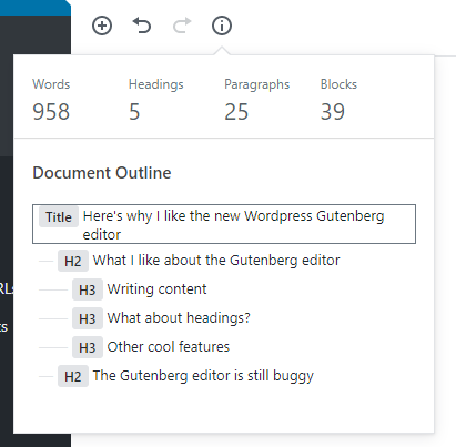
Wait, what about the word count? The classic editor kept a word count of each post directly underneath the main content box. I loved that feature, but Gutenberg doesn't include the word count underneath the content box. However, it's still there - though, it's hidden. You'll need to click on the "i" icon at the top left of the editor screen. You'll also get a clickable document outline.
The Gutenberg editor is still buggy
Word to the wise: It's still buggy as hell. I've had to play around with blocks to get them to save correctly. I've had strange issues with links and italicized text not displaying right after saving and re-loading a draft post.
For example, I had to redo all the links and bold text in this article after re-opening the draft because, for whatever reason, Gutenberg didn't save the styling correctly. When I re-opened the document, the links and bold text were transformed into visible HTML. Very frustrating.
Also, sometimes, images don't align properly even after I remove and re-add them into my post. They appear to be centered when I'm editing the post, but once I view the post through Preview mode (or after publishing), the images are no longer centered on the page.
In fact, I tried my very best to use the Gutenberg editor to write this post, but I failed. It was just too buggy. Images wouldn't align properly. Line breaks between paragraphs were not consistent. Styling changes seemed to have a mind of their own between post saves. Believe me that I really tried to make Gutenberg work properly for this post, but even though the release of Wordpress 5.0 is only a couple months away, it's apparently still too early to depend fully on Gutenberg.
Here's the bottom line: I believe that the Gutenberg editor that is slated to be released with Wordpress 5.0 in April or May has a ton of potential. The editor is beautiful and straightforward, focusing the writer on the stuff that matters most - writing.
However, there still remains a lot of work to do to get Gutenberg up to snuff, and I can totally understand why it only has 2.5 stars on the plugin's Wordpress website. It's buggy and undependable. Frustrating at times. I hope that the majority of these bugs will be ironed out before the release of Wordpress 5.0.
If you hate Gutenberg, don't worry. There will be a classic editor plugin to revert your editor back to the classic visual editor. Thus, if you want (or need) to upgrade to Wordpress 5.0, but refuse to use Gutenberg, you'll still be able to upgrade and use the familiar editor.
My recommendation is to hold off on the upgrade until 5.1 at the earliest - pending any important security-related fixes, of course.