Charting my stock market performance over the years
I decided to login to my Vanguard account to take a look at my market performance over the years. I'm seeing mostly green with a couple areas of red (hello 2015 market correction!).

Honestly, I've never liked looking at charts and graphs. Numbers don't scare me, but they also don't give me a warm and fuzzy inside when I look at them - except when those numbers reveal my personal performance in the market over the years.
I decided to login to my Vanguard account to take a look at my market performance over the years. I'm seeing mostly green with a couple areas of red (hello 2015 market correction!).
Quick note: I use Personal Capital to track my complete asset picture.
I thought that I'd burn a post by showing you some of my Vanguard graphs that represent how well my money has been working for me. Please note that Vanguard does not hold 100% of our wealth, so this is only a sub-section of our net worth. However, it does represent trends that are common throughout our entire portfolio.
My 10-year Retirement-only account performance
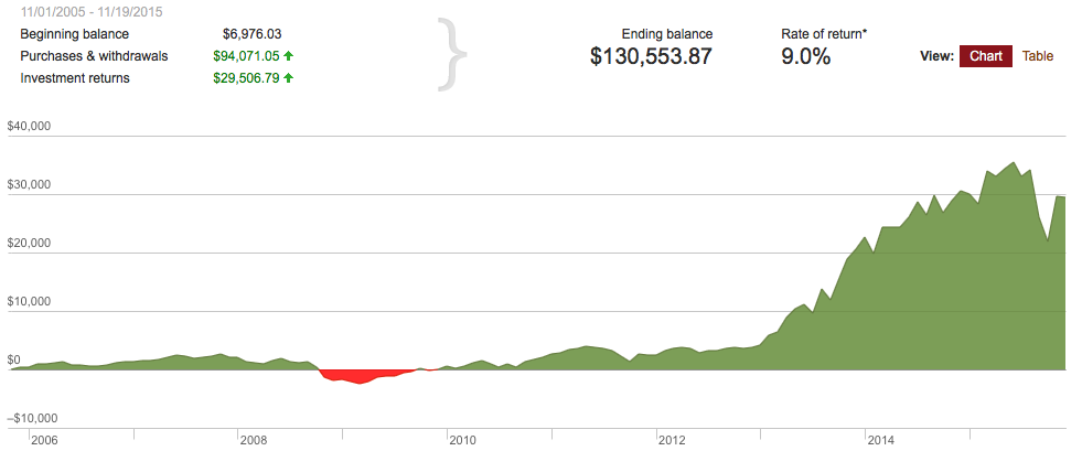
I'll take a 9% rate of return any day of the week. But, my 5-year Retirement-only account performance looks even better.
My 5-year Retirement-only account performance
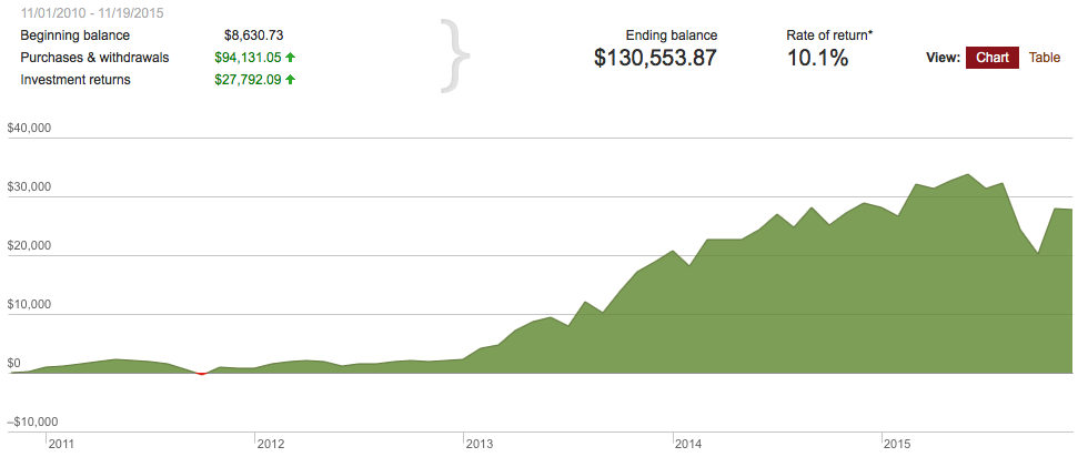
Awesome, more than a 10% return! Here is where things get a little messy. Investors have enjoyed fairly steady growth in recent history, as illustrated on the graphs above. That changed this year. Take a look at my 1-year Retirement-only account performance after this year's "correction".
My 1-year Retirement-only account performance
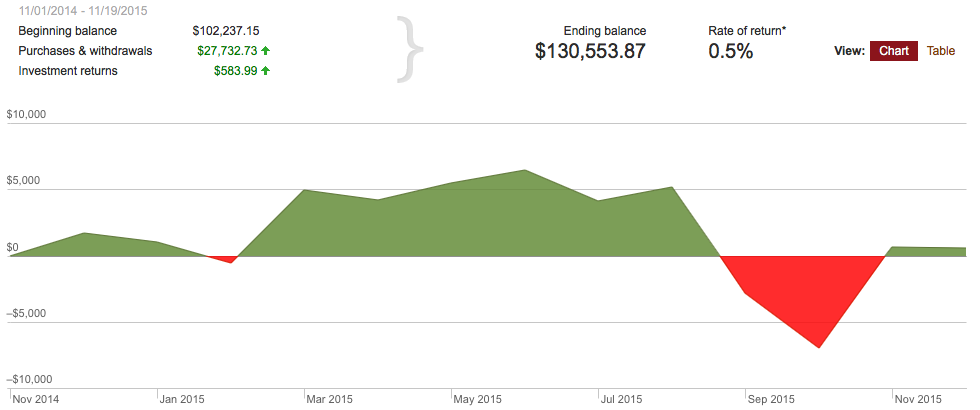
Phew! I've put in over $27-grand, but my investment returns over the past year haven't even crested the $1,000 mark. What a difference a year makes in the market.
My wife and I also have a non-retirement brokerage account at Vanguard that we just rolled over last year from another institution, so we only have a year's worth of data. However, it doesn't get much better than the previous 1-year graph.
My 1-year Non-Retirement account performance
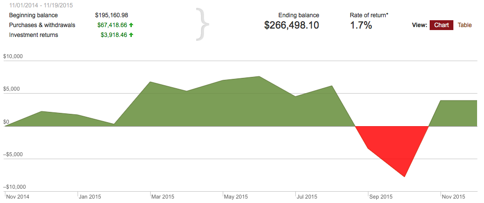
Less than 2% growth over the year. Ugh! And lastly, here's my 10-year graph for both my retirement and non-retirement accounts.
My 10-year Retirement and Non-Retirement account performance
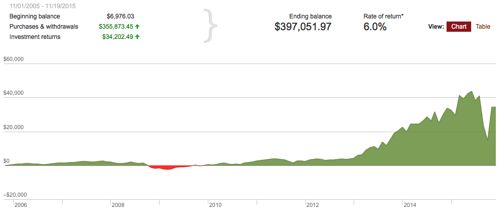
What can we learn from these graphs? First, the market has delivered nearly super-human returns in the 2013 through 2015 years. If you were invested headlong in the market during these years, you likely did very well.
But, all good things temporarily come to an end in the market. It happened this year.
My gut is telling me not to expect returns like we experienced in 2013 and 2014 in the future, but rather more consistent and gradual growth as we gingerly recover from the market downturn this year.
Either way, I am in this for the long haul.